
Science Blog · Methods
Method bias in climate records
The same ice, trees, flasks, and satellites can support different public stories. The difference is usually how the data were handled: how a stand-in is turned into temperature, which years are averaged away, what is pasted onto the end of a graph, and which energy term is treated as the cause. Most of that is bias in the method. One claim — the fossil-fuel “fingerprint” at −28‰ — is assembled after the measurement, not read from the flask.
A few terms
- Proxy
- A stand-in for temperature or CO₂ — ice, tree rings, leaf pores — not a thermometer.
- Splice
- Putting two different kinds of measurement on one graph, as when tree rings or ice are joined to weather-station temperatures.
- Albedo
- How much sunlight Earth reflects. Lower albedo means more heat absorbed.
- Skin layer
- The ocean’s top film. Infrared from the air stops here, in about ten micrometres. Sunlight heats much deeper water.
- Keeling intercept
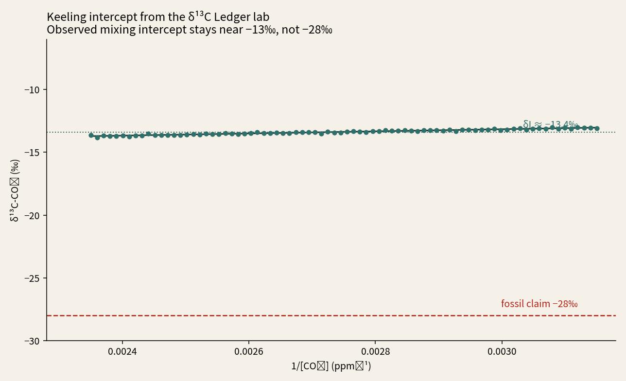
- The isotopic tag of added CO₂, read from a mixing plot. Fossil fuel is claimed at about −28‰. The flasks sit near −13‰.
A published curve is often treated as a thermometer. It usually isn’t. An ice core is a local archive. The conversion from ice chemistry to temperature can be moved. A hockey-stick graph can flatten a medieval warm period and paste instruments over a volcanic cooling. Ice-core carbon isotopes are said to match flasks only after gravity, diffusion, and calibration corrections. Recent warming follows absorbed sunlight more closely than a leftover greenhouse term. The ocean stored about twenty times more heat leaving the ice age than it has in the industrial era. That medieval-to–Little Ice Age swing happened with almost no change in ice-core CO₂.
1. Ice cores are local, and the conversion is not unique
The Alley 2000 series is an ice core from one place in Greenland. It is a local archive, not a global thermometer.
The proxy is the oxygen-18 ratio in the ice (δ¹⁸O), converted to temperature with a slope. Young snow is not ice yet; that layer is called firn. Change the slope, the elevation correction, the site noise, or the 1855 firn cutoff, and the mid-Holocene warm peak — the Holocene Thermal Maximum, or HTM — can sit warmer than Summit today. Join the same ice to Arctic weather-station temperatures on one axis, and the story flips.
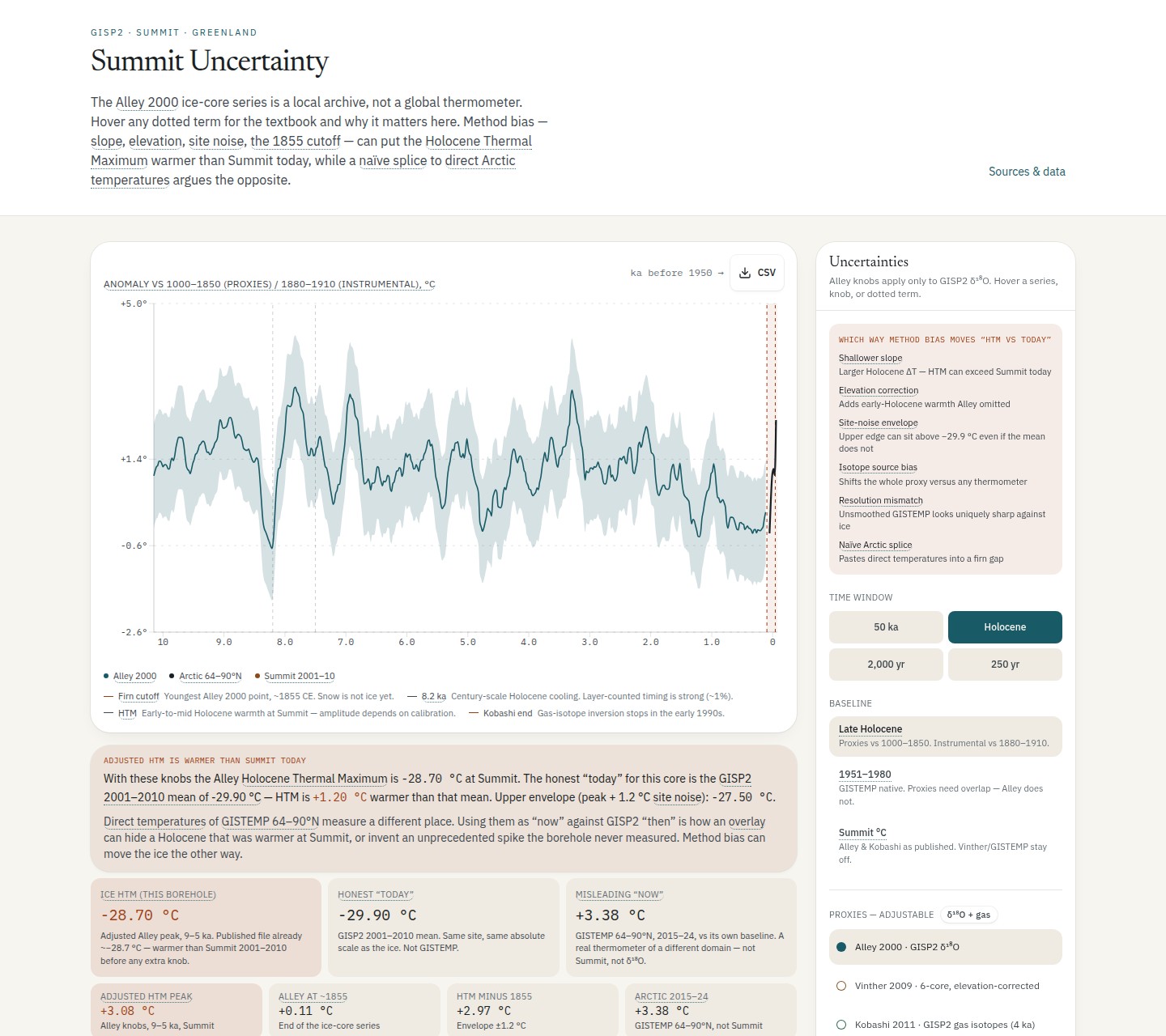
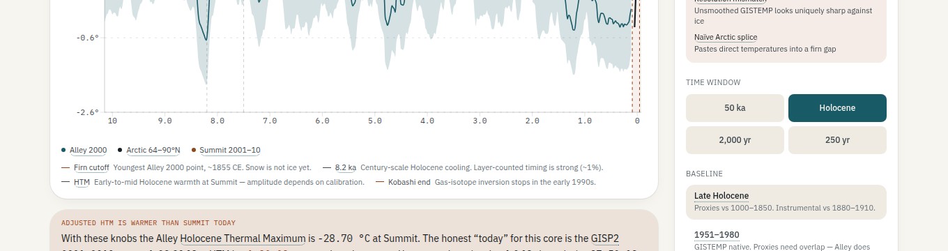
With those published choices, the lab reports an adjusted Alley HTM of −28.70 °C at Summit. At the same site, on the same baseline, GISP2 ice for 2001–2010 is −29.90 °C. The mid-Holocene is then +1.20 °C warmer than that local mean. The number often used as “now” is GISTEMP 64–90°N for 2015–24: +3.38 °C, on a different baseline, in a different place.
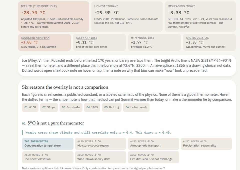
GISTEMP 64–90°N measures a different place. Using it as “now” against GISP2 “then” can hide a Holocene that was warmer at Summit, or invent an unprecedented spike the borehole never measured. Method bias can move the ice the other way.
δ¹⁸O is not a pure thermometer. Nearby Greenland cores still agree only about r ≈ 0.4. Moisture source, transport, season, elevation, drift, firn diffusion, and vapor exchange all move the isotope. The conversion slope was allowed to wander by about a factor of two.
A borehole is a temperature profile down the ice, not a year-by-year record. Heat spreading through the ice blurs swings that lasted only a few decades. Those short swings are gone from the borehole even if they were real at the surface. The published Alley series stops in the 1850s because snow is not ice yet. Dating of layers is the strong part. Temperature is the weak part: ±1.4 K on gas-isotope inversions, versus about 0.05–0.1 K on instruments.
2. The hockey stick flattens a volcanic century
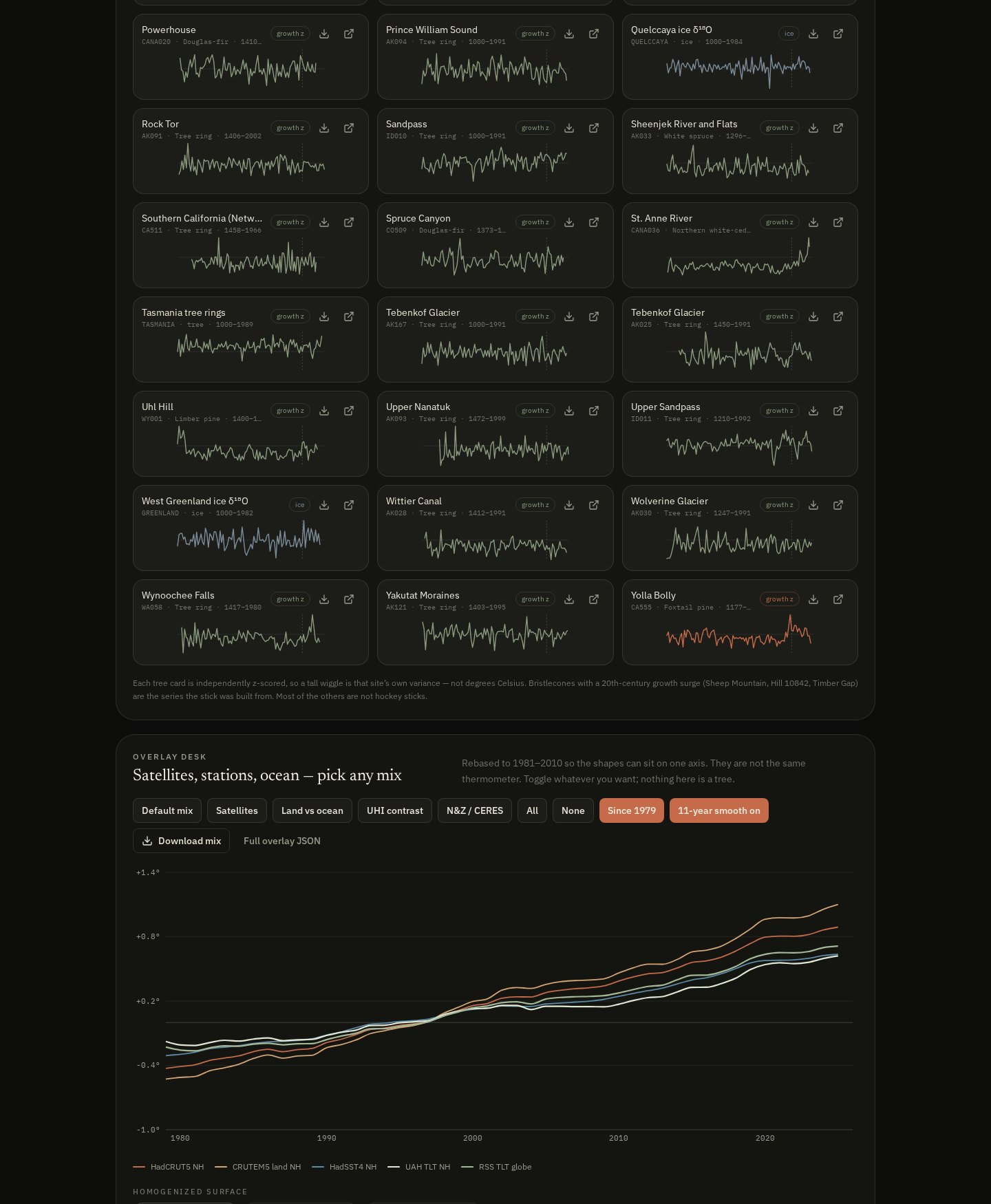
Mann, Bradley and Hughes (1998/99) drew a flat thousand years with a sharp twentieth-century upturn. The nickname is a hockey stick: a long handle, then a blade. The Hockey Stick Lab rebuilds that shape from the published tree-ring network, then shows the same century with volcanic sulfate and a single overweighted site in view.
McIntyre and McKitrick (2005) showed the blade is what you get when one strip-bark bristlecone site — Sheep Mountain, ITRDB CA534 — is weighted over 390 times the rest of the network. Fifteen bristlecone and foxtail sites accounted for 93% of the first principal component, the statistical extract that dominates the reconstruction. Many of those trees are strip-bark. Graybill and Idso (1993) already argued their twentieth-century surge is CO₂ fertilization, not temperature.
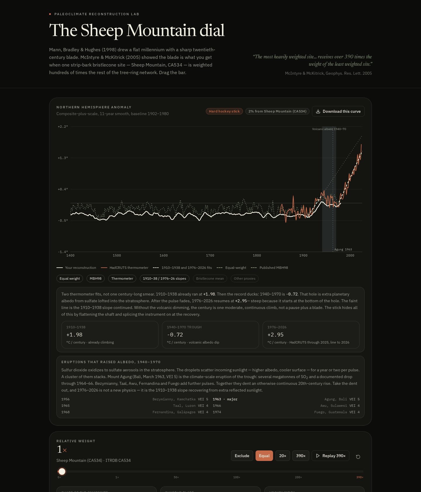
Sulfur dioxide from those eruptions becomes sulfate in the stratosphere. The droplets scatter incoming sunlight — higher albedo, cooler surface. Mount Agung (Bali, 1963) is the documented drop through 1964–66. Together they dent a rise that had already started in the 1910s, long before industrial CO₂ could explain it.
The stick hides that by flattening the earlier centuries — the handle — and joining weather stations on at the recovery. Tree-ring series are standardized growth indexes: ring width, not thermometers. HadCRUT5 is a mercury-and-satellite temperature field. Plotting them on one axis joins two different kinds of measurement.
MBH98 also never published that each North American tree-ring series was centered on the 1902–1980 mean, not the full record, before those principal components were taken. Short-centering throws any series that rises in the thermometer era far below zero in earlier centuries. The statistics then hunt those series. That is how a Medieval Warm Period and a Little Ice Age disappear into a handle.
3. Emails that treated the Medieval Warm Period as a problem
The method choices above are in the papers. The Climategate correspondence, which Kenneth Richard (@Kenneth72712993) has posted at length, shows something further: a decision to stop plotting tree rings where they diverge from weather stations, and a worry that a visible Medieval Warm Period would undercut the claim that recent warmth is unprecedented.
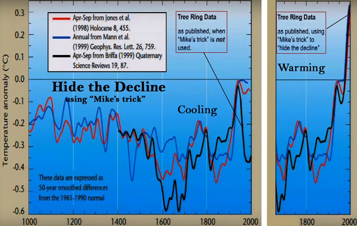
“I’ve just completed Mike’s Nature trick of adding in the real temps to each series for the last 20 years (ie from 1981 onwards) and from 1961 for Keith’s to hide the decline.”Phil Jones, 16 November 1999, to Mann, Bradley and Hughes
A later processing note is sharper. Maximum latewood density (MXD) is a tree-ring density series used as a temperature proxy. The note says “we have applied a completely artificial adjustment to the data after 1960,” and “we set all post-1960 values to missing in the MXD data set (due to decline), and the method will infill these, estimating them from the real temperatures — another way of ‘correcting’ for the decline, though may be not defensible.”
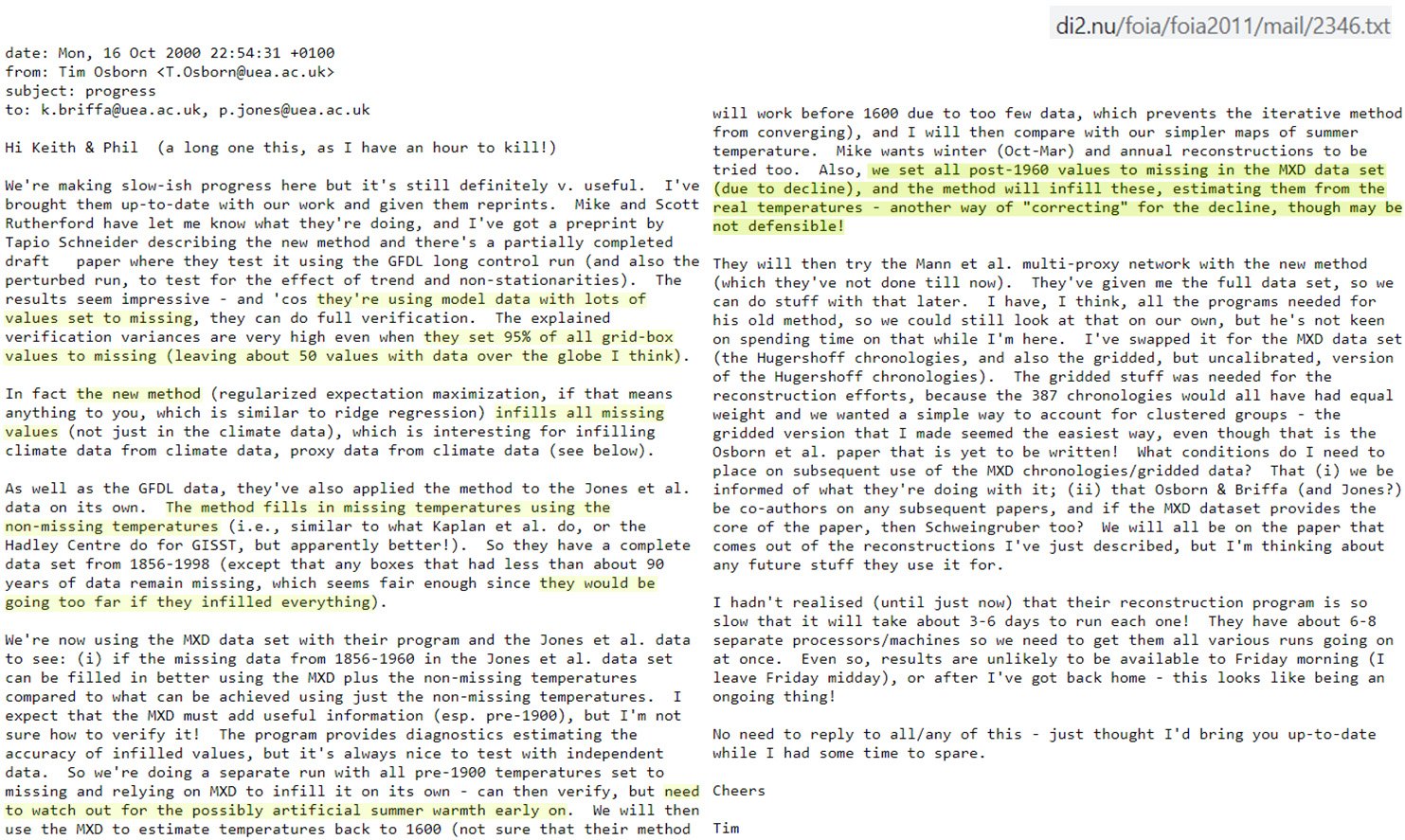
Richard’s follow-up is the bristlecone point the lab makes quantitative. Rocky Mountain strip-bark series produced hockey sticks. Trees that were not bristlecone showed cooling after the 1950s, after a rise from the 1900s to the 1940s. That is why the post-1960 values had to be replaced. The World Meteorological Organization diagram Jones was finishing did not disclose the splice.
The Medieval Warm Period was the other obstacle. Jonathan Overpeck, writing as an IPCC coordinating lead author in January 2005, told Keith Briffa and Tim Osborn he wanted to “deal a mortal blow to the misuse of supposed warm period terms and myths in the literature.” Briffa wrote back that some of Peck’s messages could be read as trying to “nail” the Medieval Warm Period — “trying to say there was no such thing.” David Deming later testified that a correspondent he believed to be Overpeck had told him, years earlier, “we have to get rid of the Medieval Warm Period.” Overpeck denied the wording. The 2005 email is not in dispute.
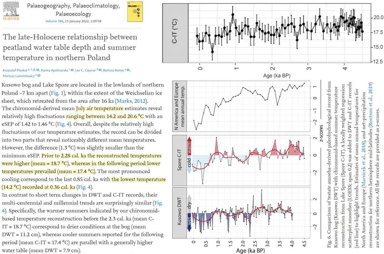
Richard’s most widely shared posts are reconstructions that keep the Medieval Warm Period and the Little Ice Age in the picture. Poland’s early-medieval July about 2.5–3 °C warmer than now. China about 2.8 °C warmer in the Roman and Medieval intervals than 1970–2000. Southern Hemisphere proxies from South America, Antarctica, Australia/New Zealand and the sub-Antarctic as warm or warmer than modern times. Those papers are why a flat handle was so useful.
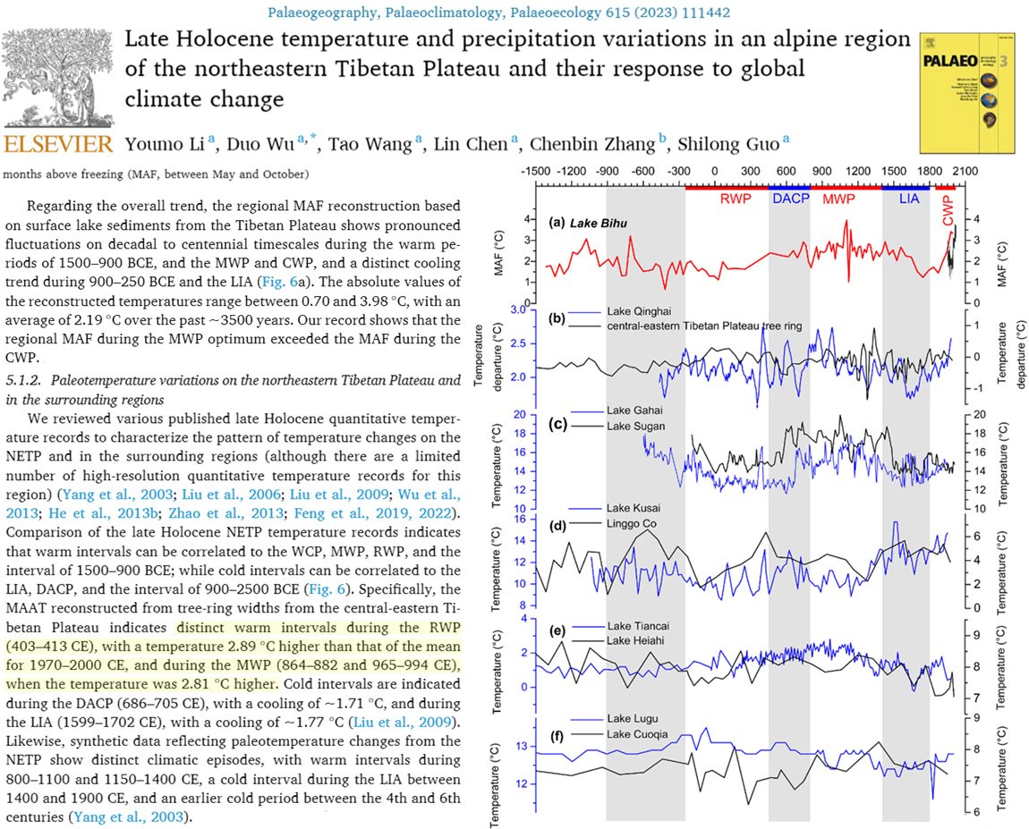
This does not require a conspiracy. It requires reading the methods next to the mail. Jones’s “trick” and the “not defensible” fill-in are presentation choices. Overpeck’s “mortal blow” is a framing choice for an IPCC box. Together they help explain how a local, volcanic, conversion-dependent century could be sold as a unique blade.
4. Smoothing can make the present look unique
Ice-core CO₂ and temperature are heavily smoothed. Smoothing averages neighboring years so short swings disappear and the line looks cleaner. Plant stomata — the pores on leaves, counted as a growing-season CO₂ proxy — still show century-scale swings. Those swings only meet the ice where the instrumental record is joined on. Presenting the smoothed ice as “the” CO₂ history, then calling the industrial tick unique, is a resolution choice, not a new measurement.
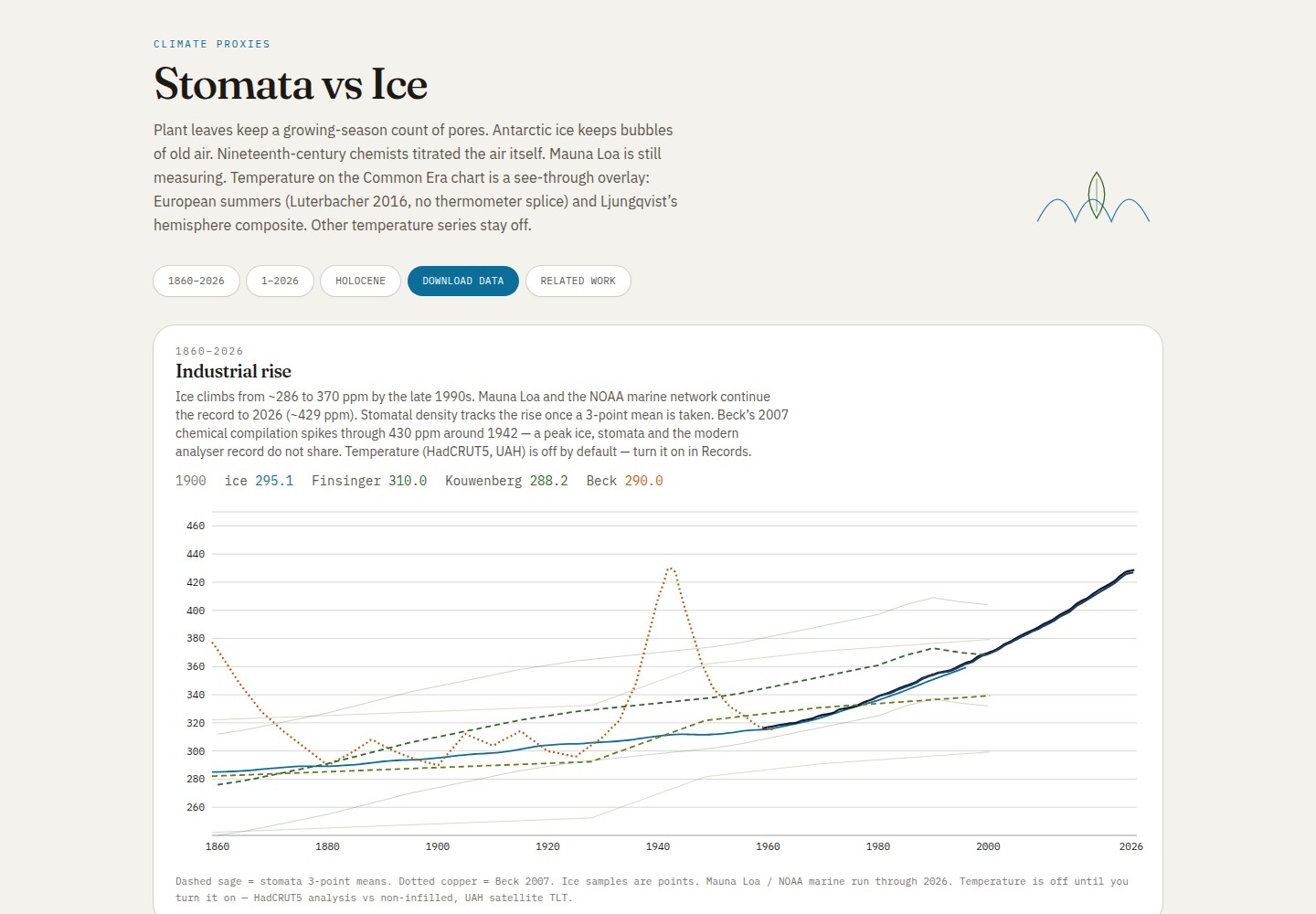
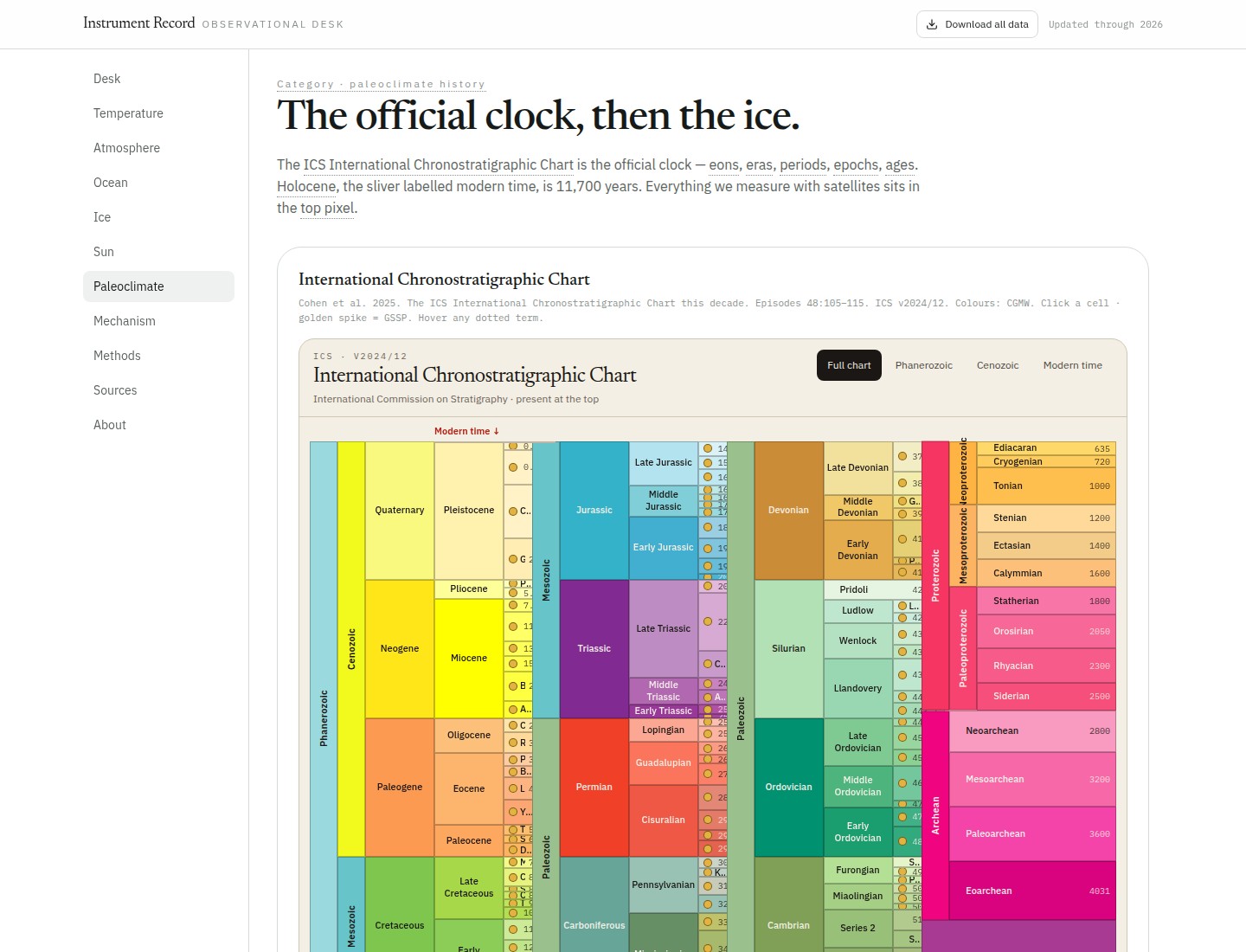
On glacial timescales, the nested paleoclimate desk shows eight Antarctic cycles keeping CO₂ between about 170 and 300 ppm, with the industrial rise as a vertical tick at the right edge. Raw data versus a 5,000-year or 200-year smooth changes how large those earlier swings look next to that tick. The official geologic clock makes the same point: everything measured by satellite sits in the top pixel of Earth history. That is context, not a claim that recent warming is unreal. It is a warning against treating a spliced, smoothed proxy as a single thermometer.
5. Recent warming tracks absorbed sunlight, not a CO₂ leftover
The Nikolov & Zeller atlas does not claim Earth has not warmed. It claims the usual ledger — greenhouse forcing, a leftover energy imbalance at the top of the atmosphere, and stored heat — is the wrong way to count. Surface temperature tracks absorbed sunlight: the solar energy Earth keeps after clouds, ice, and the rest reflect some of it away. For 2000–2026 the lab reports:
- Observed global surface temperature (GSAT) trend 0.27 K/decade
- Reconstruction from solar output (TSI) plus albedo only, no greenhouse term: 0.38 K/decade
- Absorbed sunlight (ASR) versus GSAT: R² = 0.84 (84% of the year-to-year variance)
- Energy-imbalance leftover (EEI) versus GSAT: R² = 0.45
- Planetary albedo change −0.77 percentage points (Earth reflecting less)
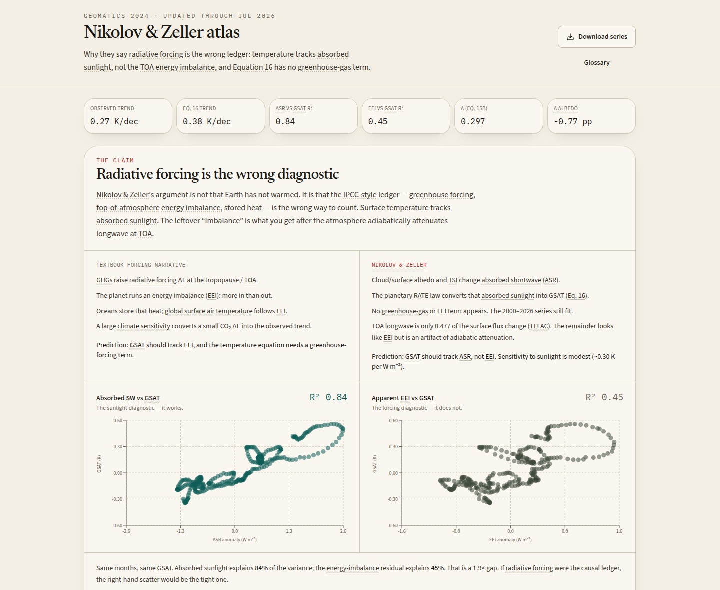
That solar-plus-albedo reconstruction follows the GISTEMP–NOAA average through July 2026. The 2023 spike sits on a record-low planetary albedo, driven mainly by reduced low cloud over oceans — not by a jump in solar output, and not mostly by polar ice. Polar ice is only a small share of the absorbed-sunlight change.
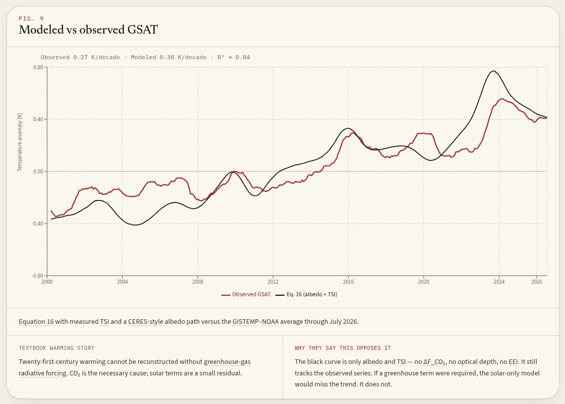
Whether the cloud decline itself is from human activity, natural, or mixed is a separate question. Once absorbed sunlight is counted, this window does not need a large leftover CO₂ term. That is method bias in what gets counted: forcing and a leftover imbalance as the ledger, versus absorbed sunlight as the ledger.
6. Ocean heat is sunlight. Greenhouse “forcing” is a lid we have not isolated.
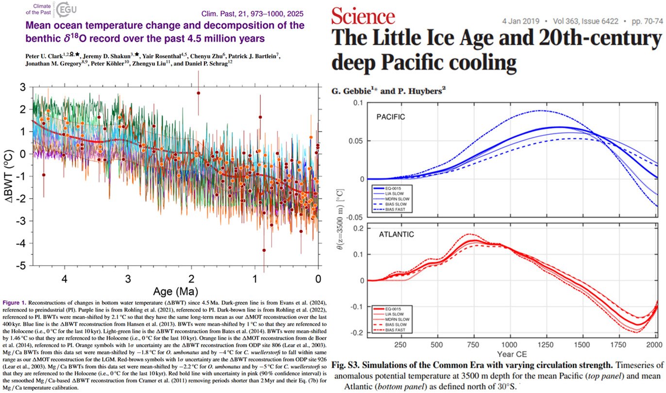
A zettajoule (ZJ) is 10²¹ joules — a huge pile of energy. The Zettajoule atlas puts the industrial ocean-heat pile next to the last deglaciation: the roughly 10,000-year exit from the ice age. Gebbie’s review of noble-gas estimates of mean ocean temperature puts that uptake at 12,000–20,000 ZJ, with a best estimate of about 14,000 ZJ, against roughly 500 ZJ for the industrial ocean through about 2017. That is at least a factor of twenty.
Kenneth Richard (@Kenneth72712993) has posted the same inventory from the literature: deglaciation 20–30 times today’s stored heat; the Medieval Climate Anomaly (the medieval warm interval) about 1,500 ZJ; modern about 500 ZJ— only a third of the way back to the ocean of a thousand years ago. Melting about 130 m of sea-level-equivalent ice took another 15,800 ZJ of latent heat. Public charts that start in 1955 hide the rest of the inventory.

The medieval ocean held about 1,000 ZJ more than the year-2000 ocean. Preindustrial ice-core CO₂ sits at about 277–285 ppm across that whole medieval-to–Little Ice Age swing of about 1,500 ZJ. The deep ocean still carries Little Ice Age water. Whatever filled and drained those zettajoules, it was not a CO₂ control we can point to in the ice.
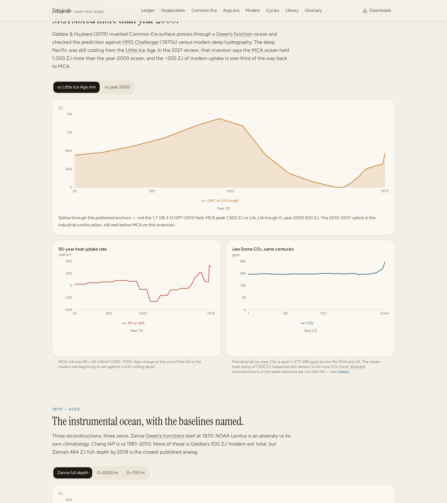
That inventory sits on a physics point the energy-budget language usually skips. Seawater is heated by shortwave sunlight — visible light — absorbed over metres in the mixed layer, the stirred upper ocean. Thermal infrared from the air, the downward beam in a greenhouse-forcing diagram, is absorbed in about ten micrometres of skin. It never reaches the volume that Argo floats and expendable probes call ocean heat content.
Greenhouse forcing and feedbacks are therefore not a heat engine for the ocean. In theory they only slow cooling at that skin: a thicker lid on the leak, so yesterday’s sunlight stays a little longer. That is a slower leak, not a new source. We have not isolated that lid in the numbers.
Richard has been citing that physics from the papers. Absorbed solar radiation, unlike CO₂, directly heats the ocean and is what tracks global heat content. CO₂ longwave can radiatively touch only the top 0.01 mm of a ~1 mm thermal skin — about 1% of the skin, none of the mixed layer, none of the deep Pacific with its centuries-long lag. A 4 W/m² forcing on that film is a calculated 0.008 K skin-temperature change. That is not a heat engine for the top 2,000 metres.
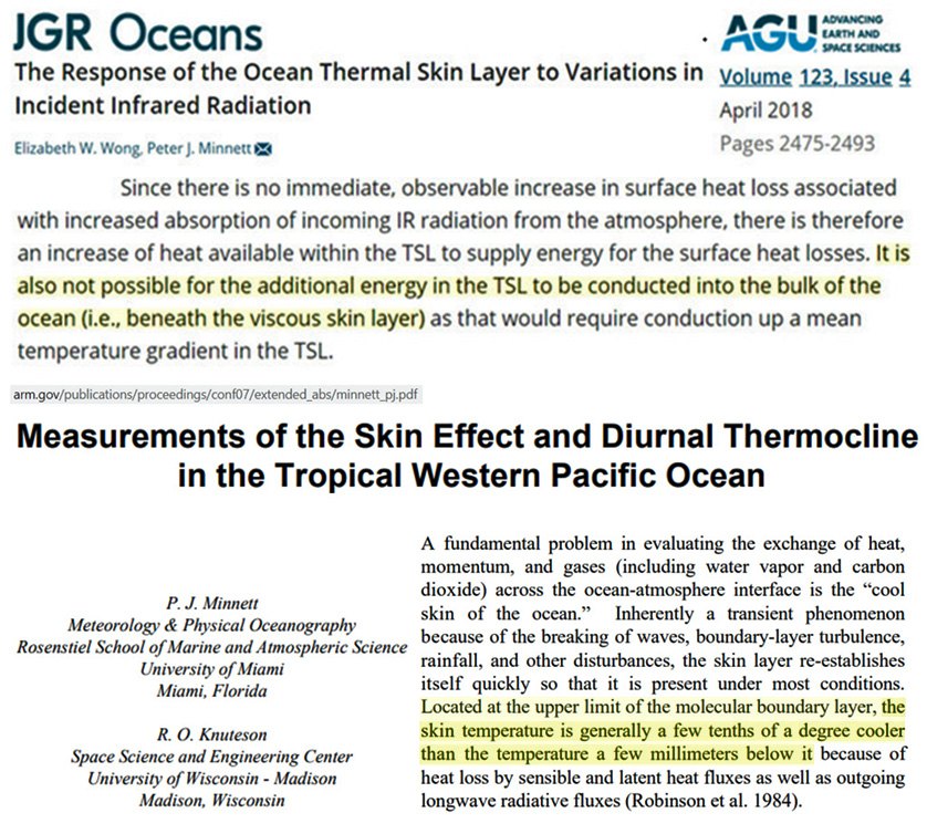
“Longwave radiation penetrates less than a millimeter through water, thus its heating and cooling effects are restricted to the very surface of the ocean: the skin layer.”Wong and Minnett 2018, as posted by Richard — who adds that any thermal-skin longwave effect is dominated by cloud forcing, with CO₂’s longwave impact too small to detect. Open the post
The next step in the literature is the one the energy-budget diagrams skip: it is not possible for the extra energy in the thermal skin to be conducted into the bulk ocean beneath the viscous skin layer. That is the difference between a lid on cooling and a source of zettajoules. Nikolov and Zeller 2024, in a widely circulated post of Richard’s, put the observational counterpart: a global longwave radiative forcing of the sort the models attribute to rising CO₂ “does not exist in reality”. Absorbed solar, not the greenhouse leftover, accounts for the post-2000 trend.
The leftover we cannot close is large. Average deglacial uptake (about 99 mW/m²) is in the same neighborhood as geothermal heat through the seafloor. Modern imbalance estimates (0.5–0.7 W/m²) are faster, and still reconstructed from sparse floats, expendable probes, and inversions. “Every ZJ here comes from a model of a measurement,” as the atlas puts it. We do not yet have a closed, instrument-verified explanation of why the ocean held more heat a thousand years ago, at 280 ppm, than in 2000. Treating the industrial 500 ZJ as a greenhouse receipt is a choice of ledger, not a completed energy audit.
7. The isotopic “fingerprint” was assembled, not observed
This is the section that goes beyond ordinary calibration bias. Carbon-13 (δ¹³C) is a heavy isotope of carbon. Fossil coal, oil, and gas are depleted in it, so a fossil dump in the air should drag the air’s δ¹³C toward about −28‰. The isotopic lab’s headline is that the number actually read from the flasks is not that fingerprint.
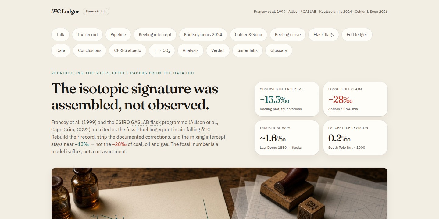
Francey et al. (1999) and the CSIRO GASLAB flask programme are cited as the fossil-fuel fingerprint in air: falling δ¹³C. Rebuild their record, strip the documented corrections, and the mixing intercept stays near −13‰ — not the −28‰ of coal, oil and gas. The fossil number is a model term, not a measurement.
A Keeling plot graphs δ¹³C against 1/[CO₂]. The intercept of that line is the net isotopic signature of the carbon being added. Seasonally adjusted flasks at Utqiaġvik, La Jolla, Mauna Loa, and South Pole recover intercepts about −12.9 to −13.3‰, with R² near 0.99. If the rise were a fossil dump, that intercept would sit near −28‰, or drift toward it as the fuel mix changed. In the lab’s epoch table it does not:
- Little Ice Age 1550–1850: intercept −11.38‰
- Early industrial 1850–1950: −10.28‰
- Post-war 1950–1978: −14.36‰
- Flask era 1978–2025: −13.23‰
Francey et al. (1999) themselves wrote that firn-air δ¹³C agrees with Cape Grim only after correction for gravitational separation, diffusion, and a latitudinal gradient, and that “complex calibration strategies are required.” Those are not hidden emails. They are the methods section. Later Rubino revisions moved a ~0.2‰ South Pole firn mismatch on paper, and applied sample selection plus a 50-year smooth. Cape Grim baseline hours reject a large fraction of flasks. Rejected air is systematically more depleted.
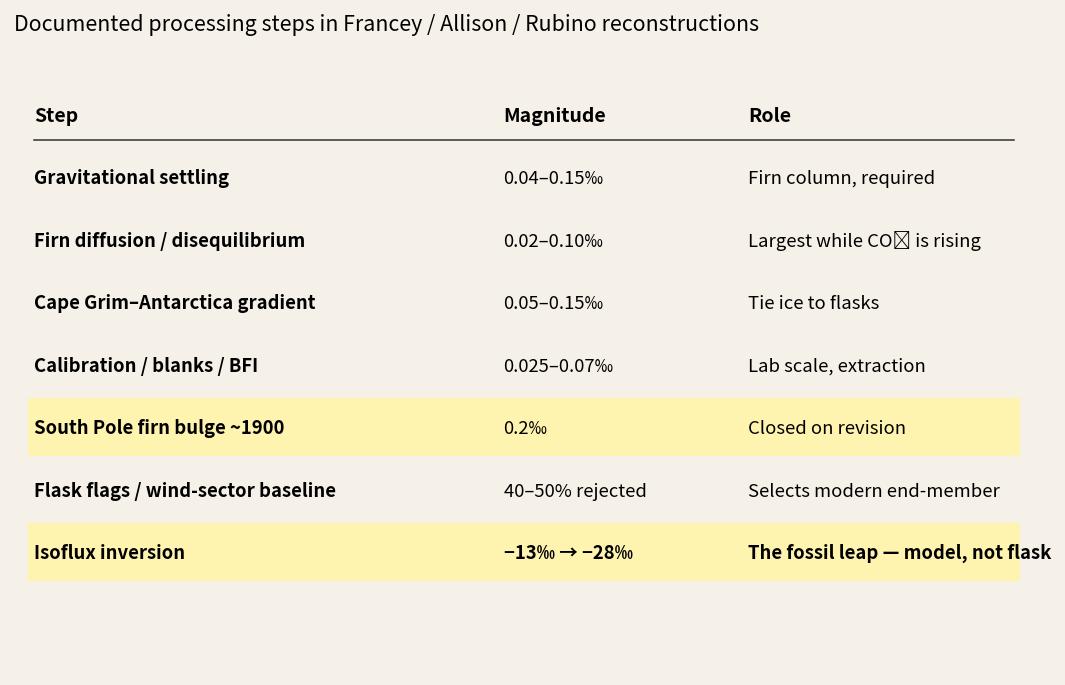
The physical firn corrections are ordinary ice-core practice. The bias claim is narrower. The public talking point that “the isotopes prove fossil fuel” presents a hybrid reconstruction plus a model identity as if it were a raw flask intercept. The flask intercept is −13‰. The −28‰ number is assembled afterwards. That is why this article treats the isotopic signature as the case that crosses from method bias into fabrication of a fingerprint.
8. Alternative reconstructions meet dossiers, not just reviews
Scientists who keep these method choices visible report a second kind of bias: rejection by identity, and reputational packaging.
Judith Curry, former chair of Earth and Atmospheric Sciences at Georgia Tech and an AMS/AGU Fellow, has described a fortress mentality after she began emphasizing uncertainty and engaging outsider blogs. Search results filled with “climate denier” frames. She left her academic chair. DeSmog’s Climate Disinformation Database entry on her is the standard package: photograph, credentials, consulting clients, selected quotes, resignation framed as citing the “craziness” of climate science.

Ned Nikolov and Karl Zeller stated that manuscripts challenging the conventional greenhouse framing were rejected, sometimes without review, after editors Googled their names. They published under reversed-name pseudonyms (Den Volokin, Lark ReLlez) to get a content-first reading. One paper was later withdrawn over the names rather than the calculations. Their later invited Geomatics paper is the atlas shown above. DeSmog maintains a Karl Zeller page that leads with the pseudonym episode.
Willie Soon is the other recurring dossier: solar papers plus energy-related funding packaged as the story, with journal ethics reviews and congressional interest following the funding narrative more loudly than the energy-balance critiques.
DeSmog presents this as accountability journalism about fossil-fuel influence. The scientists above present it as a blacklist that makes dissenters unhirable and hands activists a ready-made personal file. Political organizations that publish such dossiers know they will be used for targeting. What is not in dispute is the mechanism: a searchable personal dossier attached to a methods disagreement.
Harassment of climate researchers runs in more than one direction. Mainstream scientists have also received abuse and threats. The point here is specific: when the reply to a slope slider, a Keeling intercept, or an albedo leftover is a compiled biography rather than a competing reconstruction, the bias has left the data.
What the figures carry
- Figures 1–3: conversion slope, joining ice to weather stations, and comparing different places can make Summit’s Holocene warmer or cooler than “today.”
- Figures 4–5: the hockey-stick blade sits on a volcanic 1940–70 albedo dip and a 390× bristlecone weight. Ring-width indexes are not thermometers.
- Figures 6–9: Jones and Briffa correspondence on hiding the post-1960 tree-ring decline; Overpeck on a “mortal blow” to Medieval Warm Period language; reconstructions that keep that period several degrees above the late-20th-century mean.
- Figures 10–11: smoothing and proxy choice change whether industrial CO₂ looks like a unique spike.
- Figures 12–13: absorbed sunlight out-correlates the energy-imbalance leftover on the last 26 years. A no-greenhouse reconstruction still follows global surface temperature.
- Figures 14–18: deglaciation stored about 20× the industrial ocean-heat pile. The medieval ocean held about 1,000 ZJ more than year 2000 at about 280 ppm. Sunlight heats the mixed layer. Longwave dies in the skin. Richard’s posts and the skin-layer literature say that extra film energy is not conducted into the bulk.
- Figures 19–21: the observed isotopic intercept is −13‰. −28‰ is assembled with documented corrections plus a model flux term.
- Figure 22: the reputational layer that sits on top of those method fights.
The labs are public. The underlying papers — Alley 2000, Mann et al. 1998/99, McIntyre & McKitrick 2005, Vinther 2009, Kobashi, Francey 1999, Allison/GASLAB, Rubino 2013/2019, CERES EBAF, Nikolov & Zeller 2024, Gebbie 2021, Gebbie & Huybers 2019 — are public. The Jones, Briffa/Osborn, and Overpeck correspondence is public. Readers can move the sliders and watch the headline move. That is ordinary scientific hygiene. Treating the sliders as heresy is the bias that does not show up in the data file.